
LOGO
The logo was first envisioned to blend the richness of Wemotaci's Atikamekw culture with the soft and playful world of early childhood. As such, every shape and color choice revolves around the same intention: celebrating the community's heritage while creating a warm and reassuring landmark for families.
On one hand, the circular shape and color palette directly nod to the medicine wheel, which symbolizes togetherness, continuity, and the cycle of life. At the center, the sun shines to offer its light and warmth, recalling the CPE's role as a guide, not only for toddlers, but also for parents and elders.
On the other hand, First Nations traditions and territory are reflected through several strong symbols. The eagle feather embodies the community's wisdom and spirituality, while the tipi evokes home, hospitality, and safety. Furthermore, in the name, the "X" in the word SIX takes the shape of crossed canoe paddles, a poetic nod to traveling the land, discovery, resilience, and the act of guiding.
Finally, the bear figure symbolizes courage, respect, and work. With rounded lines reminiscent of a teddy bear, it brings a genuine touch of tenderness tailored to children, all in perfect harmony with the caring values of Jordan's Principle.


WEBSITE
We're putting the finishing touches on this section. Check back soon!
CORPORATE DOCUMENTS
To support the administrative management and internal communication of the centre, an extensive layout effort was first carried out on nearly a hundred documents. Indeed, the main goal was to standardize all tools (from tracking sheets and forms to invoices, administrative notices, and job postings) in order to offer a consistent, professional, and easily recognizable brand image.
This document suite was designed to meet the needs of parents while also making daily tasks easier for educators and the administrative team. Everything relies on a modern, airy, and vibrant design.
In addition, the majority of the sheets and forms were created in interactive versions. This choice simplifies data entry and significantly reduces day-to-day paperwork. In short, the entire package beautifully combines administrative efficiency, excellent readability, and a playful feel that recalls the world of childhood.

POSTERS
Created to brighten living spaces, these posters combine everyday utility with careful aesthetic detail. From educational materials to activity announcements, each piece offers a welcoming visual touchpoint for the community.
To achieve this, the entire collection relies on hand-drawn illustrations while highlighting touches of Atikamekw culture. Whether announcing a festive event or supporting toddlers' learning, these posters deploy a warm and unifying image.


BROCHURE / ENVELOPES / STICKERS
Designed as both a comprehensive and welcoming tool, the CPE Six Saisons brochure guides families right from the start. Featuring the touching quote "It takes a village to raise a child," this tri-fold brochure highlights the services offered, the team, the educational philosophy, as well as the operating hours. Additionally, its airy layout combines immersive photographs, soft organic shapes, and well-structured text areas to make reading easy and enjoyable.
Complementing this, the stationery is enriched with custom envelopes and brand-colored stickers. The envelopes feature a lovely colorful pattern on the flap along with subtle illustrated accents. Meanwhile, the round stickers add a nice finishing touch to official mailings and documents handed out to parents.


EDUCATIONAL BOOKS
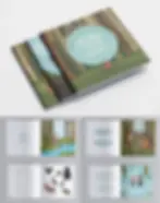
At the heart of this major project lies the creation of a custom collection of 34 hand-illustrated books for CPE Six Saisons. Designed to spark curiosity from an early age, each book pairs engaging visuals with cultural storytelling. The series includes 21 educational books on key learning themes and 13 infant books that bring two topics together in a single story.
On one hand, to keep older children engaged, each educational book wraps up with playful activities and a quick comprehension quiz. The warm illustrations guide them through heartwarming stories that naturally build vocabulary and spark imagination.
On the other hand, culture and language are at the core of this collection. Every single book ends with a trilingual pronunciation guide in French, English, and Atikamekw. Beyond helping Wemotaci’s children learn, it gives educators and families an easy, practical way to celebrate their heritage every day.


BUS WRAP
The bus wrap brings CPE Six Saisons' new visual identity to life well beyond its walls. Instantly recognizable on the road and throughout the Wemotaci community, this large-format design seamlessly combines soft organic shapes, a distinctive color palette, and the official logo.
Additionally, featuring the turtle adds a playful and warm touch. Straight from one of the educational books, it also winks back at the website homepage, creating a wonderful visual continuity across the entire brand.
Thus, this project successfully transforms daily commutes and educational outings for toddlers into a true source of community pride and visibility for the institution.


EMAIL SIGNATURE
To bring the brand identity to life right down to everyday communications, a custom email signature was created for the CPE Six Saisons team. Perfectly aligned with the institution's visual identity, it standardizes electronic mailings while offering a professional, modern, and welcoming presentation.


LOGO
The logo was first envisioned to blend the richness of Wemotaci's Atikamekw culture with the soft and playful world of early childhood. As such, every shape and color choice revolves around the same intention: celebrating the community's heritage while creating a warm and reassuring landmark for families.
On one hand, the circular shape and color palette directly nod to the medicine wheel, which symbolizes togetherness, continuity, and the cycle of life. At the center, the sun shines to offer its light and warmth, recalling the CPE's role as a guide, not only for toddlers, but also for parents and elders.
On the other hand, First Nations traditions and territory are reflected through several strong symbols. The eagle feather embodies the community's wisdom and spirituality, while the tipi evokes home, hospitality, and safety. Furthermore, in the name, the "X" in the word SIX takes the shape of crossed canoe paddles, a poetic nod to traveling the land, discovery, resilience, and the act of guiding.
Finally, the bear figure symbolizes courage, respect, and work. With rounded lines reminiscent of a teddy bear, it brings a genuine touch of tenderness tailored to children, all in perfect harmony with the caring values of Jordan's Principle.


WEBSITE
We're putting the finishing touches on this section. Check back soon!
CORPORATE DOCUMENTS
To support the administrative management and internal communication of the centre, an extensive layout effort was first carried out on nearly a hundred documents. Indeed, the main goal was to standardize all tools (from tracking sheets and forms to invoices, administrative notices, and job postings) in order to offer a consistent, professional, and easily recognizable brand image.
This document suite was designed to meet the needs of parents while also making daily tasks easier for educators and the administrative team. Everything relies on a modern, airy, and vibrant design.
In addition, the majority of the sheets and forms were created in interactive versions. This choice simplifies data entry and significantly reduces day-to-day paperwork. In short, the entire package beautifully combines administrative efficiency, excellent readability, and a playful feel that recalls the world of childhood.
POSTERS
Created to brighten living spaces, these posters combine everyday utility with careful aesthetic detail. From educational materials to activity announcements, each piece offers a welcoming visual touchpoint for the community.
To achieve this, the entire collection relies on hand-drawn illustrations while highlighting touches of Atikamekw culture. Whether announcing a festive event or supporting toddlers' learning, these posters deploy a warm and unifying image.

BROCHURE / ENVELOPES / STICKERS
Designed as both a comprehensive and welcoming tool, the CPE Six Saisons brochure guides families right from the start. Featuring the touching quote "It takes a village to raise a child," this tri-fold brochure highlights the services offered, the team, the educational philosophy, as well as the operating hours. Additionally, its airy layout combines immersive photographs, soft organic shapes, and well-structured text areas to make reading easy and enjoyable.
Complementing this, the stationery is enriched with custom envelopes and brand-colored stickers. The envelopes feature a lovely colorful pattern on the flap along with subtle illustrated accents. Meanwhile, the round stickers add a nice finishing touch to official mailings and documents handed out to parents.
EDUCATIONAL BOOKS
At the heart of this major project lies the creation of a custom collection of 34 hand-illustrated books for CPE Six Saisons. Designed to spark curiosity from an early age, each book pairs engaging visuals with cultural storytelling. The series includes 21 educational books on key learning themes and 13 infant books that bring two topics together in a single story.
On one hand, to keep older children engaged, each educational book wraps up with playful activities and a quick comprehension quiz. The warm illustrations guide them through heartwarming stories that naturally build vocabulary and spark imagination.
On the other hand, culture and language are at the core of this collection. Every single book ends with a trilingual pronunciation guide in French, English, and Atikamekw. Beyond helping Wemotaci’s children learn, it gives educators and families an easy, practical way to celebrate their heritage every day.


BUS WRAP
The bus wrap brings CPE Six Saisons' new visual identity to life well beyond its walls. Instantly recognizable on the road and throughout the Wemotaci community, this large-format design seamlessly combines soft organic shapes, a distinctive color palette, and the official logo.
Additionally, featuring the turtle adds a playful and warm touch. Straight from one of the educational books, it also winks back at the website homepage, creating a wonderful visual continuity across the entire brand.
Thus, this project successfully transforms daily commutes and educational outings for toddlers into a true source of community pride and visibility for the institution.
EMAIL SIGNATURE
To bring the brand identity to life right down to everyday communications, a custom email signature was created for the CPE Six Saisons team. Perfectly aligned with the institution's visual identity, it standardizes electronic mailings while offering a professional, modern, and welcoming presentation.
Anchored in the heart of the Atikamekw community of Wemotaci located in Quebec, Canada, the CPE Six Saisons is a true place of life, learning, and care for toddlers and their families.
The idea behind this project was to create a vibrant, playful, and meaningful brand identity that honors the richness of Indigenous culture while remaining perfectly tailored to the world of childhood. From the logo and website to the stationery, educational books, and bus wrap, every element was designed to celebrate the Atikamekw heritage in a soft and colorful universe.
.png)


